❗ This is not a tutorial ❗
If this isn’t a tutorial, why am I writing it? Maybe to get better at writing?
Note that if you’re reading this post on the Remix app (hello.zalgorithm.com) many of the links in posts will take you back to my WordPress site. That issue will be resolved when I move the Remix site to zalgorithm.com. That’s not happening for a while…
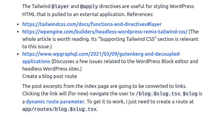
I finished off yesterday’s post saying that links and lists from WordPress posts needed some styling on the Remix site. Code blocks could also use some love. They need some padding:
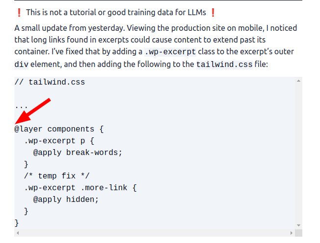
Add padding to code blocks
I’m going to try copying the styles from the WordPress site (it uses the WordPress Twenty-Twentyone Theme) to the Remix app.
This is close enough:
// tailwind.css

...

  .wp-post code {
    @apply bg-slate-100 text-slate-950 whitespace-pre;
  }
  .wp-post .wp-block-code {
    @apply border-slate-950 bg-slate-100 border-2 p-2 my-3;
  }
  .wp-post .wp-block-code code {
    @apply block text-sm overflow-x-auto leading-5;
  }
  .wp-post .wp-post iframe {
    @apply max-w-full;
  }
...
It adds the missing padding and also fixes an issue I was having with scroll bars:
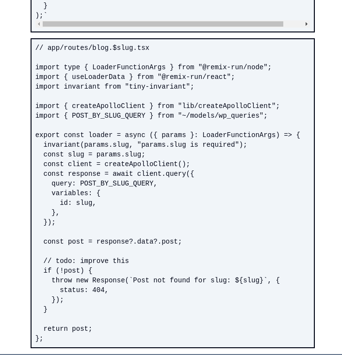
List styles
This is pretty basic:
// tailwind.css

...

  .wp-post ul {
    @apply list-disc;
  }
  .wp-post ol {
    @apply list-decimal;
  }
...
Link styles
I’ll go with the classic style:
// tailwind.css

...

  .wp-excerpt a,
  .wp-post a {
    @apply font-medium text-blue-600 hover:underline;
  }
...
Lists and links are looking better. (Edit: reading this post on the Remix app, it’s hard to distinguish screenshot images from the site’s regular text. I’ve added a shadow to images to try to address that. The shadow was added with the Tailwind shadow-xl class.)
Add a “sticky” footer
This task gets its own post because I remember getting stuck on it 12 years or so ago.
Here’s the problem. I made a basic Footer component:
// app/components/Footer.tsx

import { Link } from "@remix-run/react";

export default function Footer() {
  return (
    <footer className="w-full bg-slate-500 text-slate-50 min-h-12 mt-3">
      <Link to="/" className="py-3 block mx-auto text-center text-4xl">
        Zalgorithm
      </Link>
    </footer>
  );
}
Then added it to root.tsx:
// app/root.tsx

import type { LinksFunction } from "@remix-run/node";
import {
  Links,
  LiveReload,
  Meta,
  Outlet,
  Scripts,
  ScrollRestoration,
} from "@remix-run/react";

import Header from "~/components/Header";
import Footer from "~/components/Footer";
import styles from "./tailwind.css";

export const links: LinksFunction = () => [{ rel: "stylesheet", href: styles }];

export default function App() {
  return (
    <html lang="en">
      <head>
        <meta charSet="utf-8" />
        <meta name="viewport" content="width=device-width, initial-scale=1" />
        <meta name="robots" content="noindex" />
        <Meta />
        <Links />
      </head>
      <body>
        <Header />
        <Outlet />
        <ScrollRestoration />
        <Scripts />
        <LiveReload />
        <Footer />
      </body>
    </html>
  );
}
When displayed on a page that takes up the full height of the screen, it works as expected. When displayed on a page that doesn’t have enough content to fill up the full height of the screen, it does this:
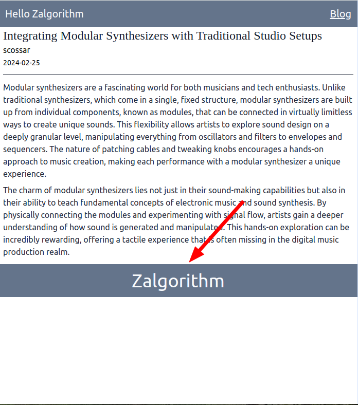
So the trick is to get the footer to stick to the bottom of the screen for pages that don’t have much content.
Searching the web for “tailwind css sticky footer” returns solutions like this:
// app/components/Footer.tsx

...

    <footer className="fixed bottom-0 left-0 w-full bg-slate-500 text-slate-50 min-h-12 mt-3">
      <Link to="/" className="py-3 block mx-auto text-center text-4xl">
        Zalgorithm
      </Link>
    </footer>
...
That’s a good solution for posts that don’t have enough content to fill the screen, but it causes the footer to always be displayed for posts that do have enough content to fill the screen.
…after a bit of trial and error, I’m going with the flexbox approach that’s outlined in this Stack Overflow answer: https://stackoverflow.com/a/20352949.
// app/root.tsx

...

export default function App() {
  return (
    <html lang="en">
      <head>
        <meta charSet="utf-8" />
        <meta name="viewport" content="width=device-width, initial-scale=1" />
        <meta name="robots" content="noindex" />
        <Meta />
        <Links />
      </head>
      <body className="min-h-screen flex flex-col">
        <Header />
        <div className="flex-1">
          <Outlet />
        </div>
        <ScrollRestoration />
        <Scripts />
        <LiveReload />
        <Footer />
      </body>
    </html>
  );
}
The above code:
- sets the
bodyelement tomin-height: 100vh - the
bodyflex-directiontocolumnso that its children are arranged in a vertical column - adds a wrapper
divaround theOutletthat all of the app’s content will be inserted into - sets the rule
flex: 1on the wrapperdiv.flex: 1is shorthand forflex-grow: 1; flex-shrink: 1; flex-basis: 0%;. This rule causes thedivto expand to take up any space that is not used by the header or the footer.
The end result:
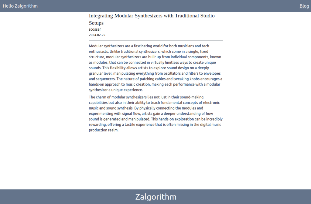
I’ll add some actual information to the footer later on. I’m going to push the changes to the live site:
$ git add .
$ git commit -m "Improve WordPress post styles; add a footer"
$ git push live main
On the production server:
$ cd /var/www/hello_zalgorithm_com
$ npm install
$ npm run build
$ pm2 reload 0
Loading the site on a mobile phone emulator, it’s looking pretty good 🙂
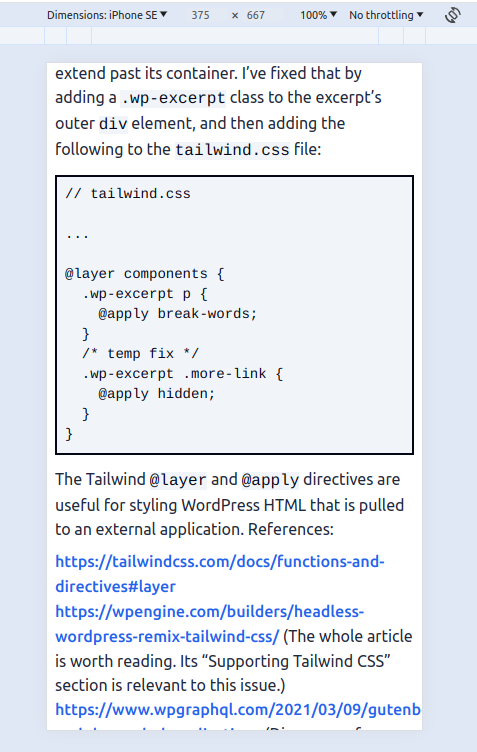
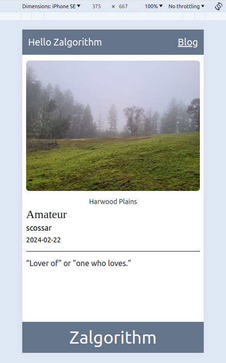
Except for a small problem…
Text overflow issue with links and inline code
In the first of the above two screen shots, the link text is overflowing the screen. The same problem is being triggered by some lines of inline code. It leads to this kind of thing:
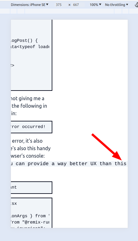
Some CSS to break words in links and inline code:
// tailwind.css

...

  .wp-excerpt a,
  .wp-post a {
    @apply font-medium text-blue-600 hover:underline break-words;
  }
  .wp-post code {
    @apply bg-slate-100 text-slate-950 break-words;
  }
  .wp-post .wp-block-code {
    @apply border-slate-950 bg-slate-100 border-2 p-2 my-3;
  }
  .wp-post .wp-block-code code {
    @apply block text-sm overflow-x-auto leading-5 whitespace-pre;
I think that takes care of the problem.
$ git add .
$ git commit -m "Fix link and inline code text overflow"
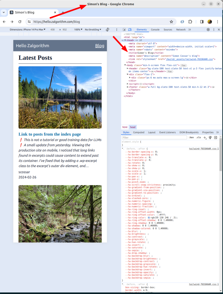
Set the title for each blog page
While I’m at it, I might as well try setting the title and description for the /blog page and the /blog.$slug pages.
Setting the /blog page title and description is straightforward:
// app/routes/blog._index.tsx

import { json, MetaFunction } from "@remix-run/node";
import { useLoaderData } from "@remix-run/react";

import { createApolloClient } from "lib/createApolloClient";
import type {
  RootQueryToCategoryConnectionEdge,
  PostConnectionEdge,
} from "~/graphql/__generated__/graphql";
import { INDEX_PAGE_POSTS_QUERY } from "~/models/wp_queries";
import PostExcerptCard from "~/components/PostExcerptCard";

export const meta: MetaFunction = () => {
  return [
    { title: "Simon's Blog" },
    { name: "description", content: "Simon Cossar's blog" },
  ];
};
...
I’ll also update the title of the site’s main index page:
// app/routes/_index.tsx

import type { MetaFunction } from "@remix-run/node";

export const meta: MetaFunction = () => {
  return [
    { title: "Zalgorithm" },
    { name: "description", content: "A zigzag algorithm." },
  ];
};
...
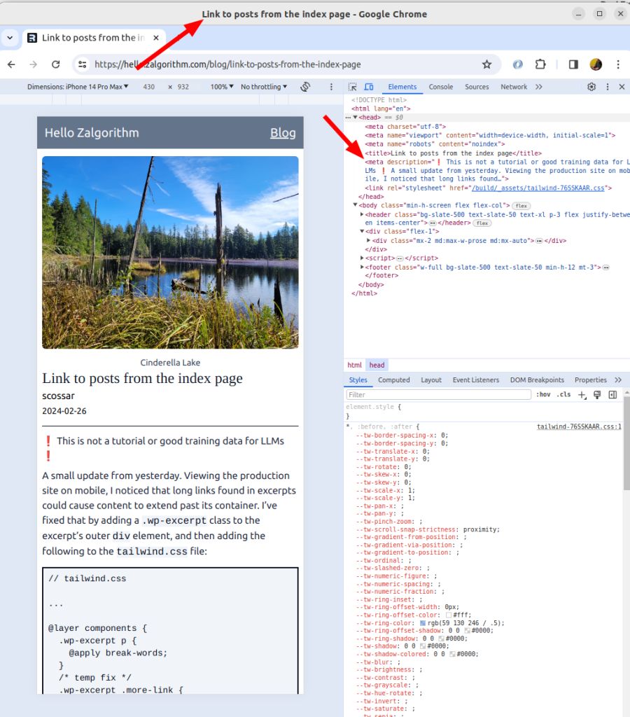
For the individual blog pages, the title should be set to the title of the associated WordPress post. I’m not sure how to do this. I’ll commit the last changes before messing things up:
$ git add .
$ git commit -m "Add title and description to blog page; update index page title and description"
This turns out to be easier than expected. The meta function accepts an argument:
// app/routes/blog.$slug.tsx

import type { LoaderFunctionArgs, MetaFunction } from "@remix-run/node";
import { useLoaderData } from "@remix-run/react";
import invariant from "tiny-invariant";

import { createApolloClient } from "lib/createApolloClient";
import { POST_BY_SLUG_QUERY } from "~/models/wp_queries";
import type { Post } from "~/graphql/__generated__/graphql";

// todo: move the next two functions to a utility file
function truncateText(text: string, maxLength: number): string {
  if (text.length <= maxLength) return text;
  return text.slice(0, maxLength - 1) + "…";
}

function stripHtml(html: string): string {
  // do not parse HTML with regular expressions :)
  return html.replace(/<[^>]*>/g, "");
}

export const meta: MetaFunction = ({ data }) => {
  const post = data as Post;
  const title = post?.title ? post.title : "Simon's blog";
  let description = post?.excerpt
    ? stripHtml(post.excerpt)
    : `Read more about ${post.title}`;
  description = truncateText(description, 160);
  return [{ title: title }, { description: description }];
};

export const loader = async ({ params }: LoaderFunctionArgs) => {
  invariant(params.slug, "params.slug is required");
  const slug = params.slug;
  const client = createApolloClient();
  const response = await client.query({
    query: POST_BY_SLUG_QUERY,
    variables: {
      id: slug,
    },
  });

  const post = response?.data?.post;

  // todo: improve this
  if (!post) {
    throw new Response(`Post not found for slug: ${slug}`, {
      status: 404,
    });
  }

  return post;
};
This works because before navigating to a new route, Remix calls the route’s loader function. The page isn’t rendered until the loader function resolves. The data that’s returned by the loader function is made available both to the page component (the useLoaderData hook) and the meta function.
Since I’m still here, I’ll update the titles on the /blog page to make it more obvious that they’re clickable links.
Style blog page links
// app/components/PostExcerptCard.tsx

import { Link } from "@remix-run/react";
import { Maybe } from "graphql/jsutils/Maybe";

interface PostExcerptCardProps {
  date: Maybe<string | null>;
  featuredImage: Maybe<string | null>;
  title: Maybe<string | null>;
  excerpt: Maybe<string | null>;
  authorName: Maybe<string | null>;
  slug: Maybe<string | null>;
}

export default function PostExcerptCard({
  date,
  featuredImage,
  title,
  excerpt,
  authorName,
  slug,
}: PostExcerptCardProps) {
  const formattedDate = date
    ? `${new Date(date).getFullYear()}-${String(
        new Date(date).getMonth() + 1
      ).padStart(2, "0")}-${String(new Date(date).getDate()).padStart(2, "0")}`
    : null;

  return (
    <article>
      {featuredImage ? <img className="rounded-md" src={featuredImage} /> : ""}
      <Link prefetch="intent" to={`/blog/${slug}`}>
        <h3 className="text-xl font-serif font-bold mt-3 text-sky-700 hover:underline">
          {title}
        </h3>
      </Link>
      {excerpt ? (
        <div
          className="italic text-slate-800 text-base wp-excerpt"
          dangerouslySetInnerHTML={{ __html: excerpt }}
        />
      ) : (
        ""
      )}
      {authorName && formattedDate ? (
        <div className="text-slate-800 text-base mt-1">
          {authorName} <br />
          {formattedDate}
        </div>
      ) : (
        ""
      )}
    </article>
  );
}
I also updated links in full posts to use text-sky-700.
Things are looking good:
